
Monospace Fonts
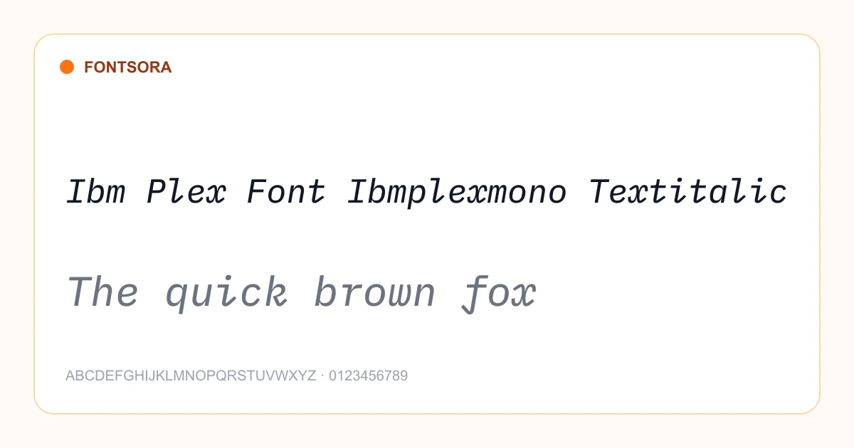
Fixed-width monospace fonts perfect for code, terminals, and technical aesthetics.
4 fonts in this category
Advertisement
How to choose a monospace font
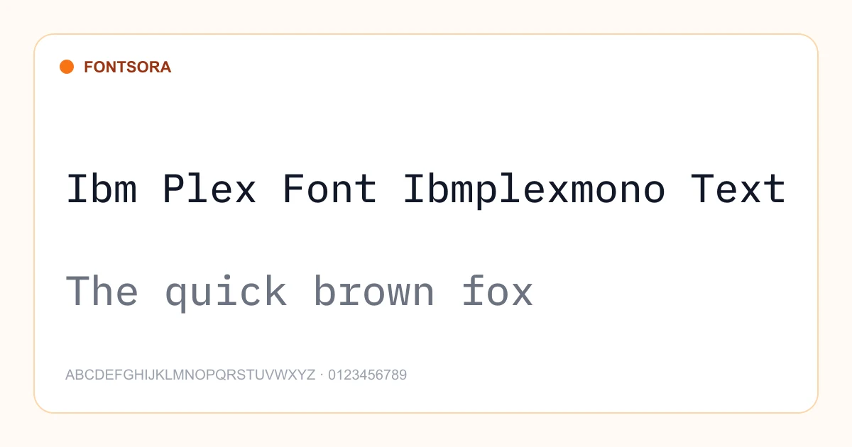
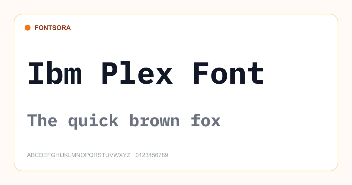
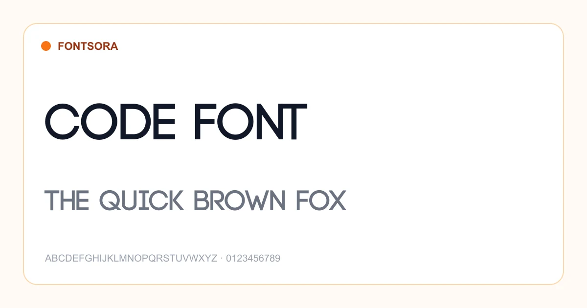
Monospace fonts assign the same horizontal width to every character. That predictable alignment is essential for code and tabular text, and it also creates a recognizable technical or typewriter-inspired aesthetic. For sustained reading, compare character distinction, punctuation, weight, and spacing rather than relying only on appearance.
Best uses
- • Code editors and terminals
- • Technical documentation
- • Tabular data
- • Typewriter-inspired identities
Selection tips
- • Compare easily confused characters such as zero and O or one, I, and lowercase l.
- • Check punctuation and symbols if the font will be used for programming.
- • Use comfortable line height because fixed-width text can appear visually dense.
Monospace font questions
What is a monospace font?
In a monospace font every character occupies the same horizontal width, allowing letters, numbers, and symbols to align in consistent columns.
Why are monospace fonts used for coding?
Consistent character widths make indentation and aligned structures easier to scan, while well-designed coding fonts also distinguish similar symbols.
Can monospace fonts be used in branding?
Yes. They can communicate technology, systems, archives, or a typewriter aesthetic when used intentionally.
Preview your own wording on each font page and review its license before publishing or selling your design. Browse the complete Fontsora font library to compare more styles.
Other Categories
Script
Elegant cursive and flowing script typefaces perfect for logos, invitations, and creative projects.
13 fonts
Calligraphy
Classical and modern calligraphy typefaces inspired by traditional pen-and-ink lettering.
1 font
Serif
Timeless serif fonts with traditional letterforms conveying authority and readability.
22 fonts
Sans Serif
Clean, modern sans-serif typefaces ideal for UI design, branding, and digital content.
44 fonts
Display
Bold, expressive display fonts designed to command attention in headlines and posters.
420 fonts
Decorative
Ornate and decorative typefaces that bring personality and artistic flair to designs.
1 font