
Sans Serif Fonts
Clean, modern sans-serif typefaces ideal for UI design, branding, and digital content.
44 fonts in this category
Advertisement
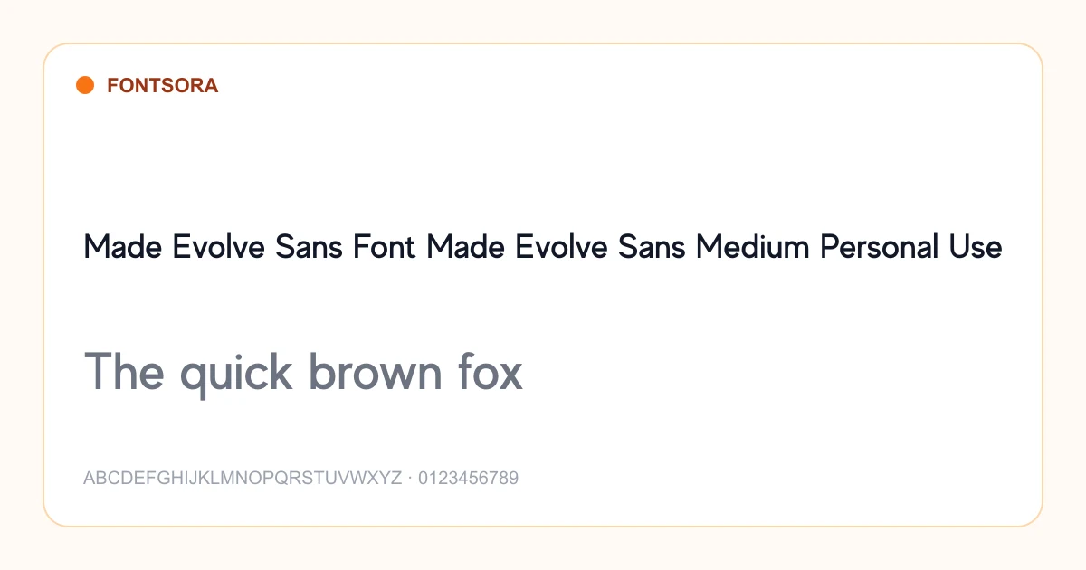
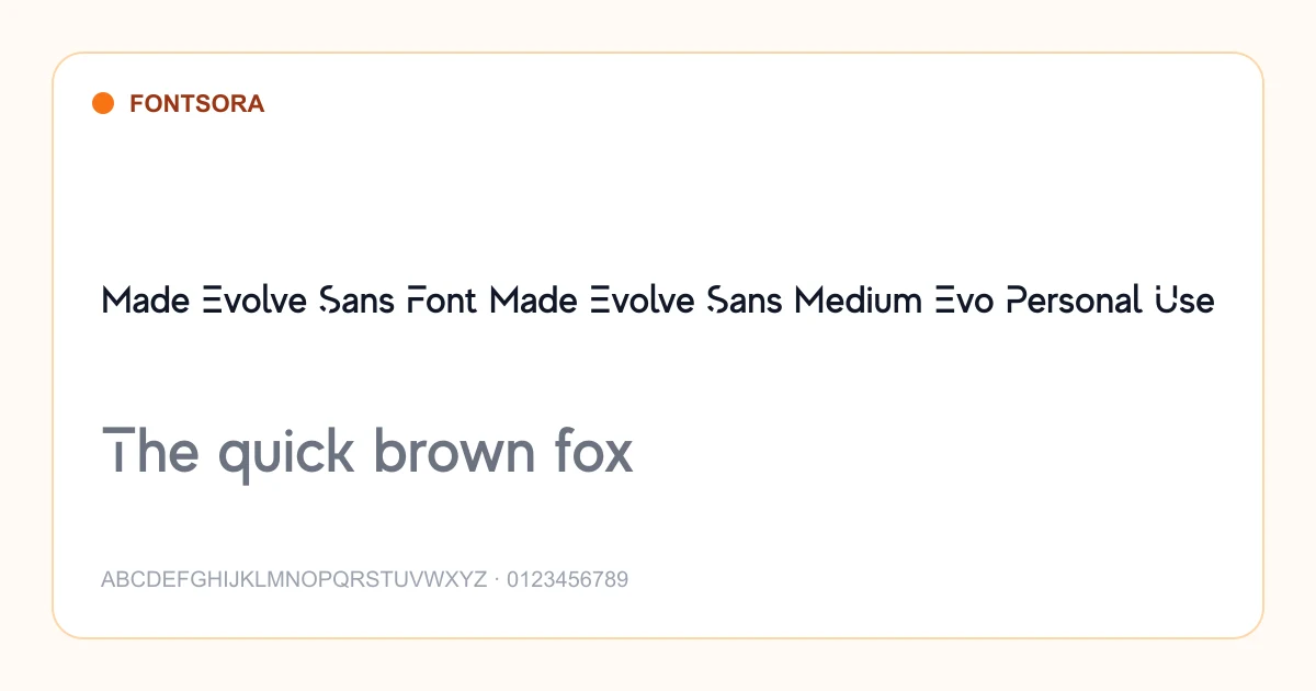
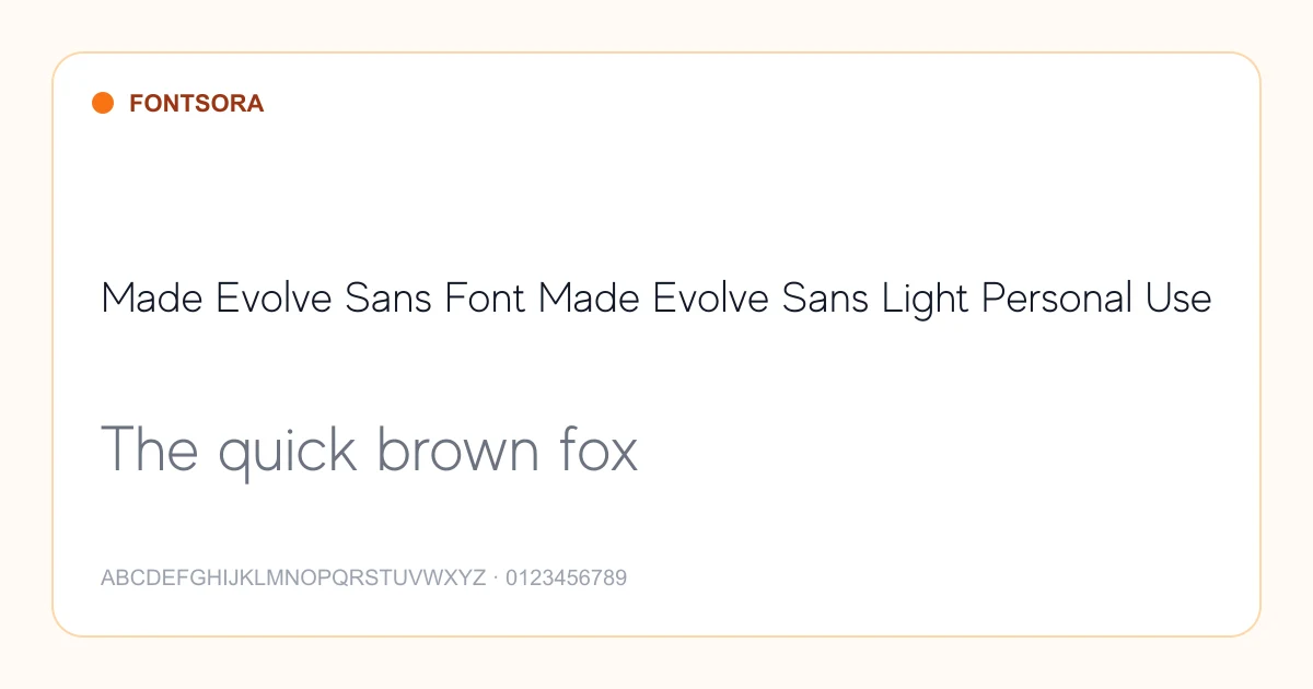
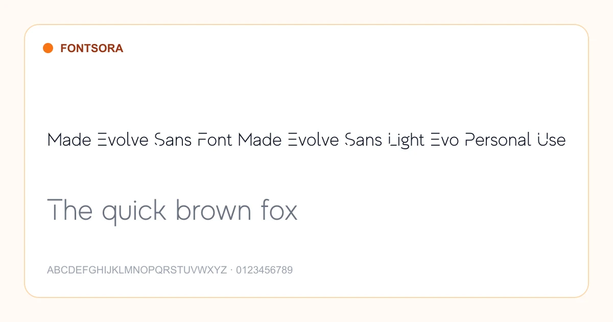
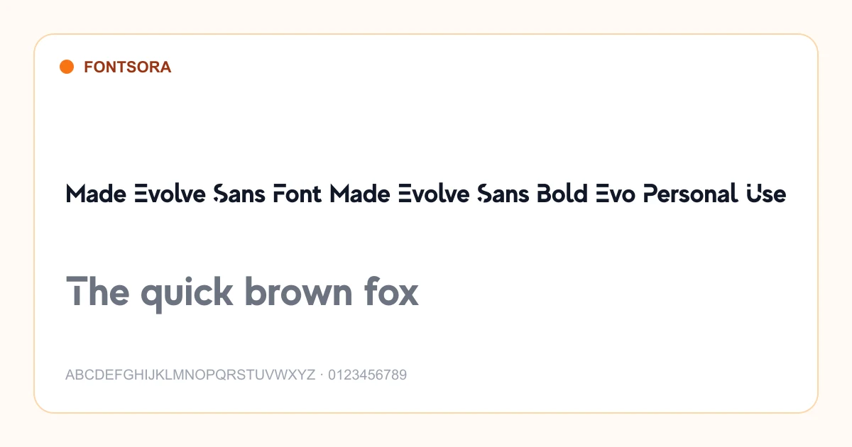
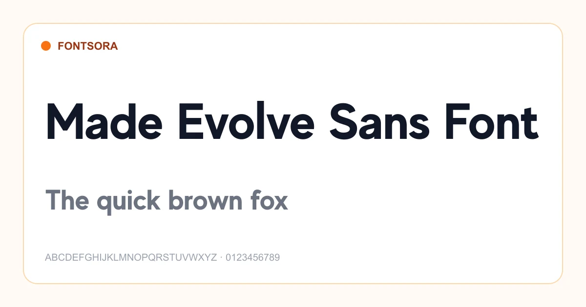
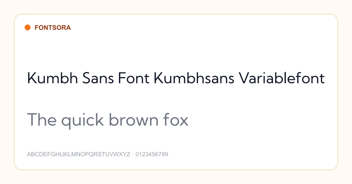
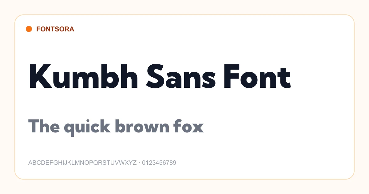
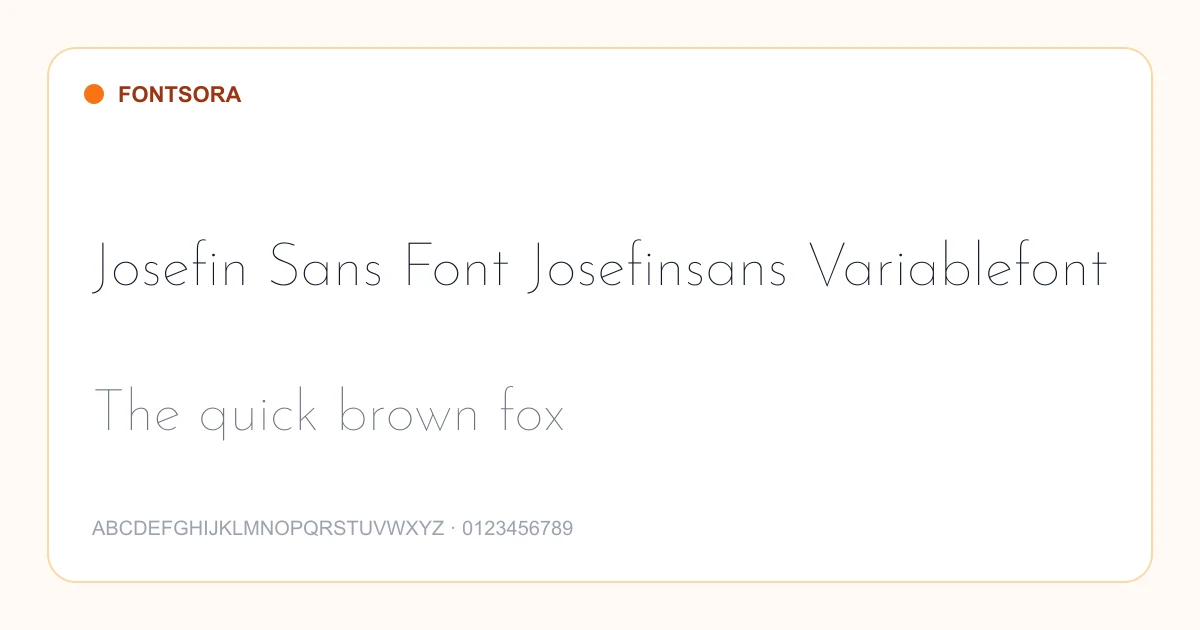
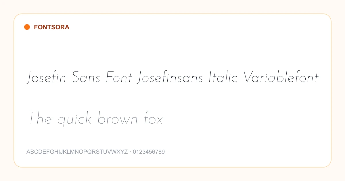
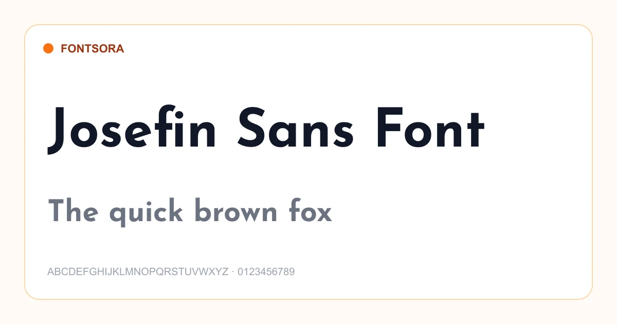
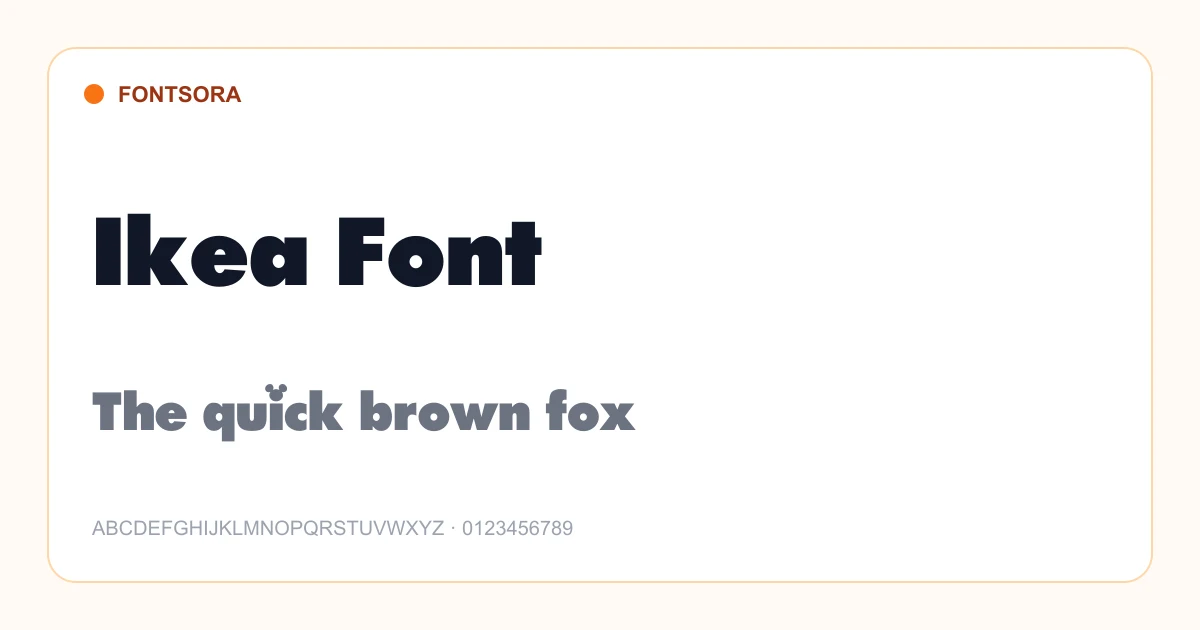
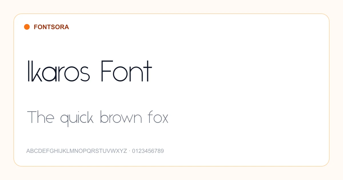
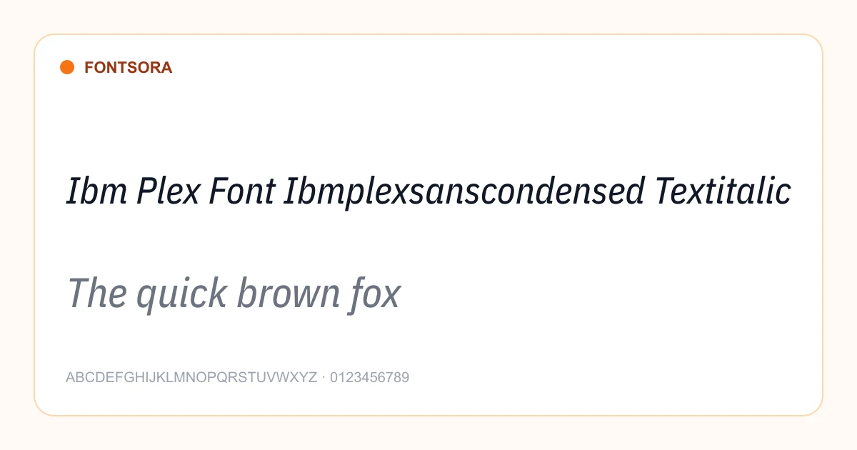
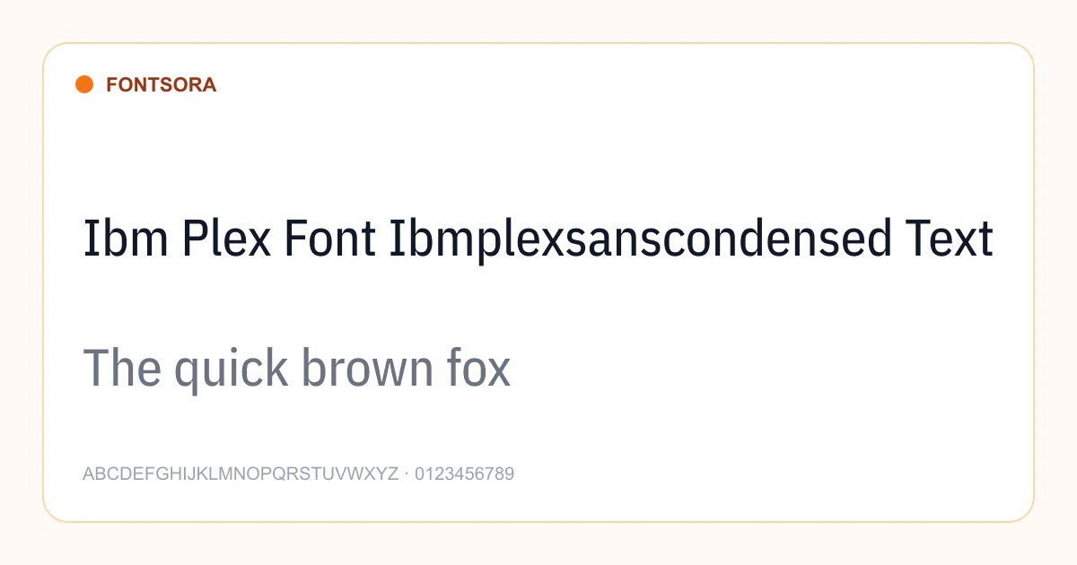
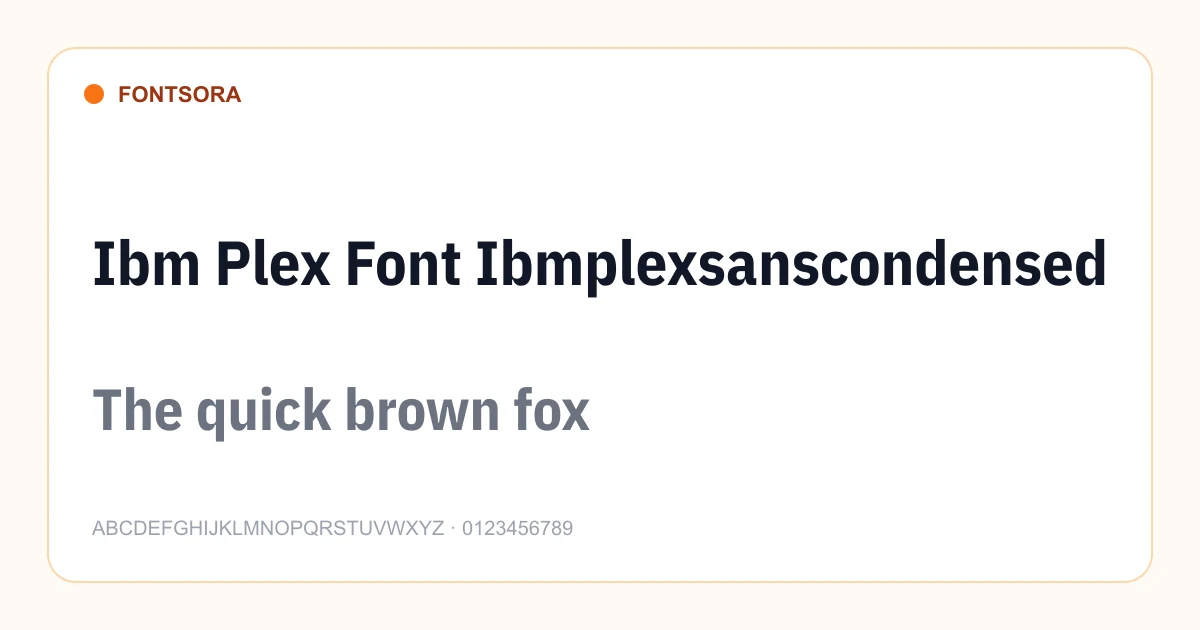
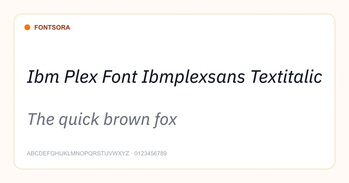
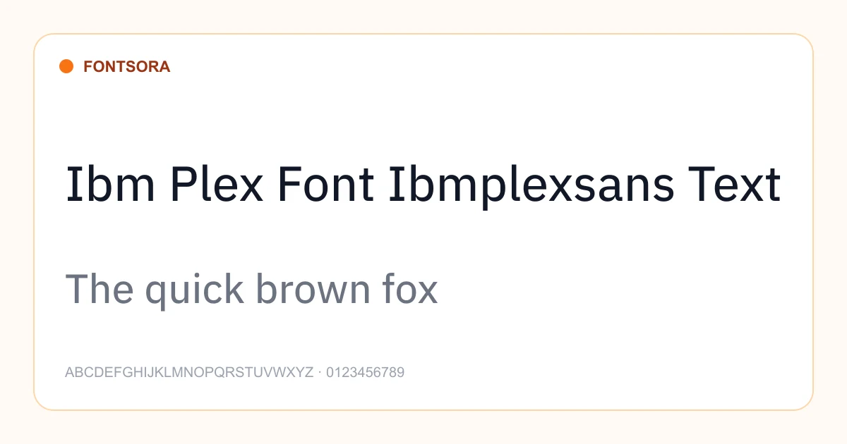
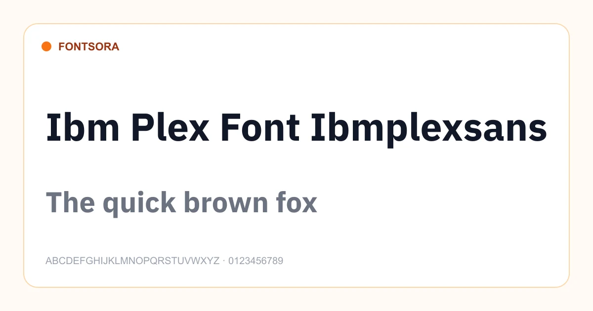
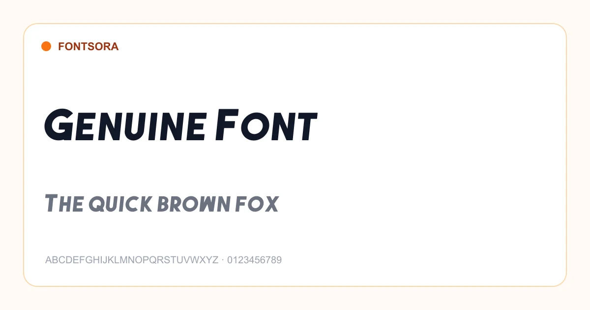
How to choose a sans serif font
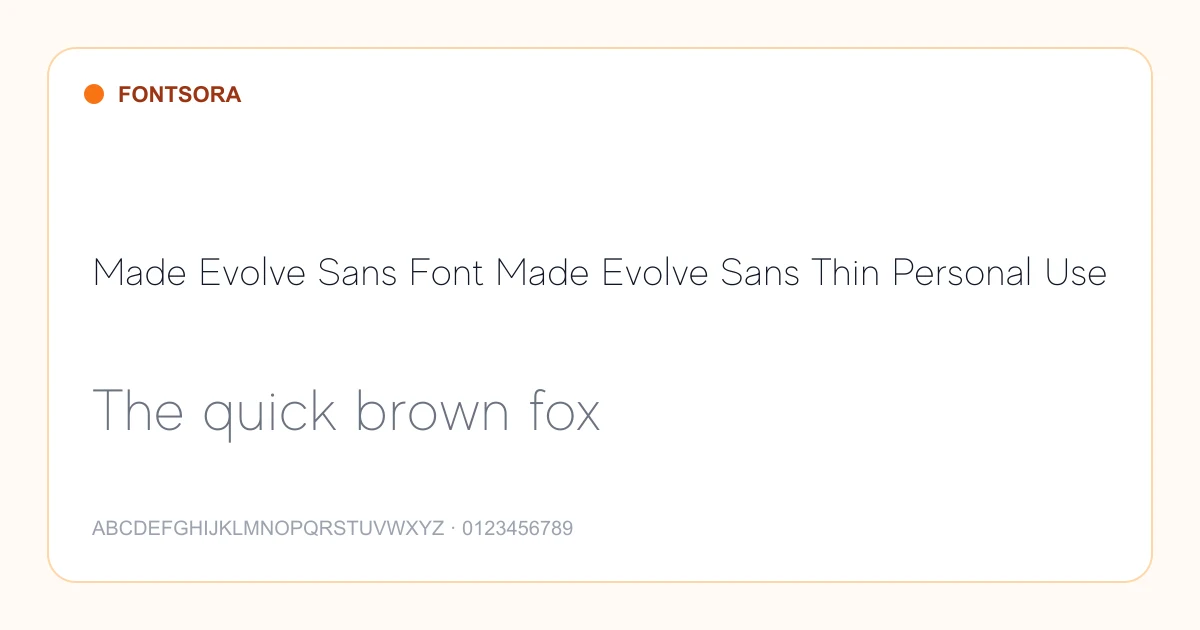
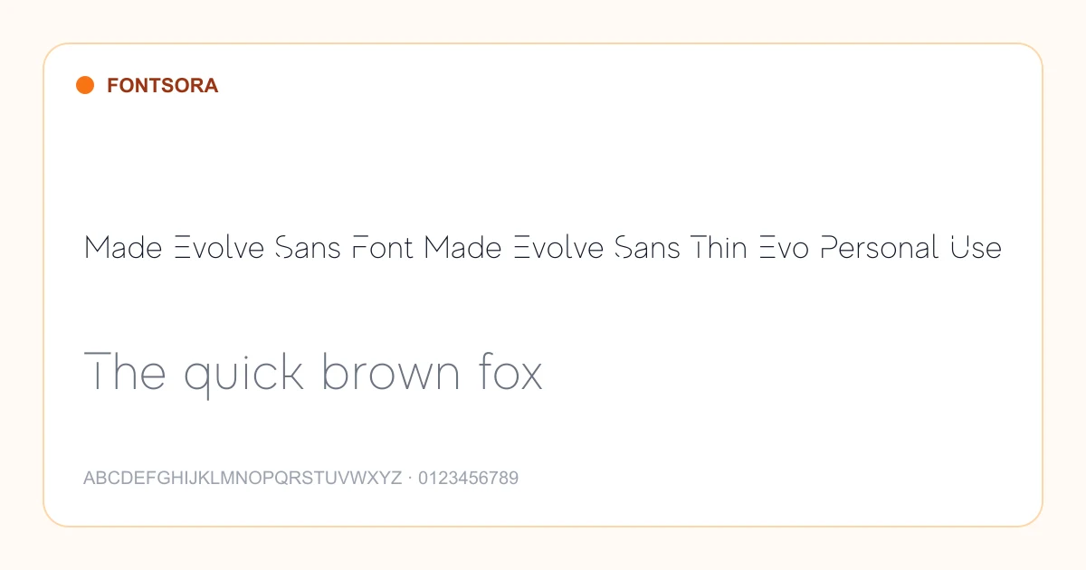
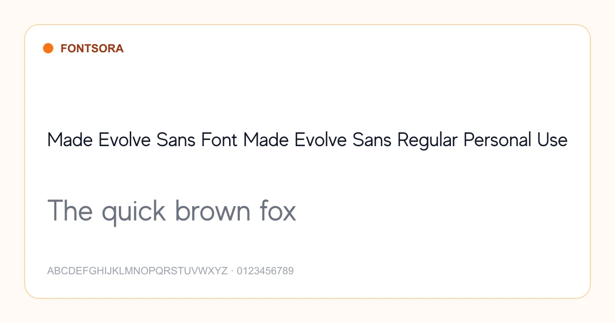
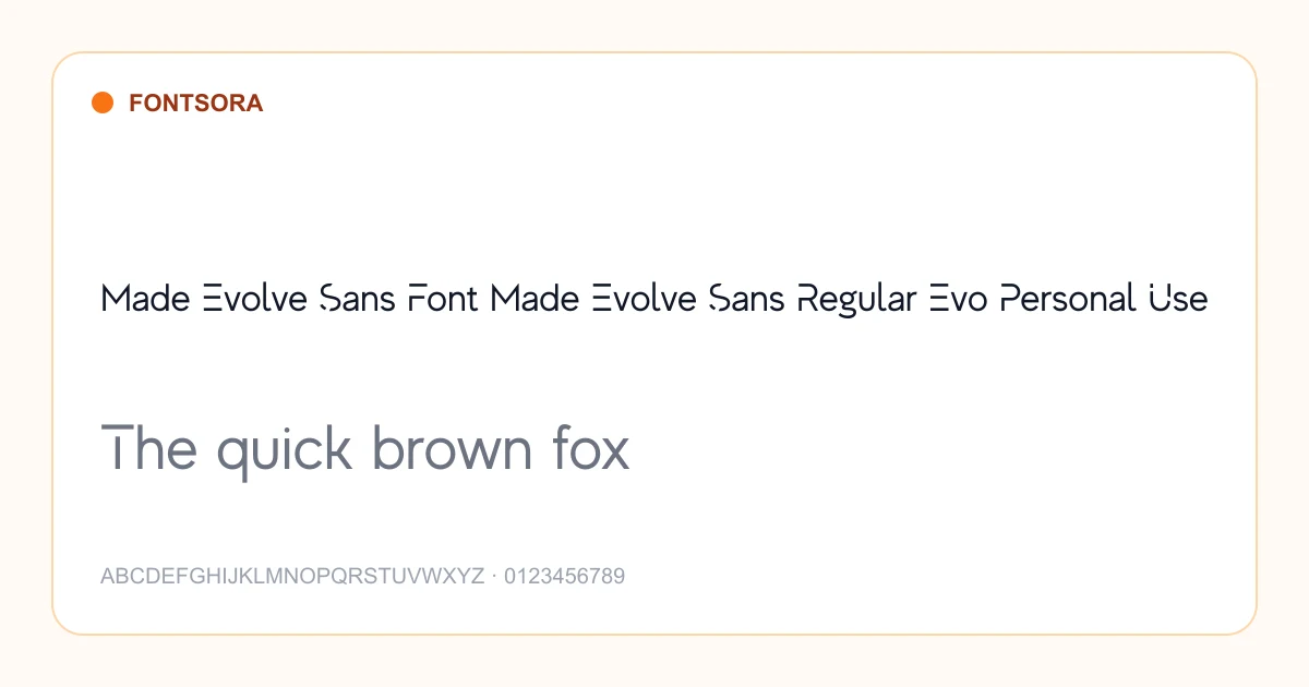
Sans serif fonts use clean letterforms without the finishing strokes found on serif typefaces. Their clarity and flexible tone make them a practical choice for interfaces, websites, presentations, brand systems, signage, and contemporary editorial design. Look beyond style alone: spacing, weight range, numerals, and readability at small sizes determine whether a family will work in a real project.
Best uses
- • Websites and mobile interfaces
- • Modern brand identities
- • Presentations and reports
- • Signage and wayfinding
Selection tips
- • Test regular and medium weights at normal body-text sizes before choosing a family.
- • Check that bold, italic, numerals, and punctuation cover the hierarchy your project needs.
- • For interfaces, favor open shapes and clearly differentiated characters such as I, l, and 1.
Sans Serif font questions
What is a sans serif font?
A sans serif font has letterforms without decorative finishing strokes, producing a clean appearance that is common in digital products and modern branding.
Are sans serif fonts easier to read on screens?
Many sans serif families perform well on screens because of their open shapes and simple details, although spacing, size, contrast, and the specific typeface matter more than category alone.
Which font pairs well with a sans serif?
A contrasting serif often creates a useful editorial hierarchy. Two sans serif families can also work when their proportions and roles are clearly different.
Preview your own wording on each font page and review its license before publishing or selling your design. Browse the complete Fontsora font library to compare more styles.
Other Categories
Script
Elegant cursive and flowing script typefaces perfect for logos, invitations, and creative projects.
13 fonts
Calligraphy
Classical and modern calligraphy typefaces inspired by traditional pen-and-ink lettering.
1 font
Serif
Timeless serif fonts with traditional letterforms conveying authority and readability.
22 fonts
Display
Bold, expressive display fonts designed to command attention in headlines and posters.
420 fonts
Decorative
Ornate and decorative typefaces that bring personality and artistic flair to designs.
1 font
Gothic
Dark, dramatic gothic and blackletter typefaces with historical character.
4 fonts