
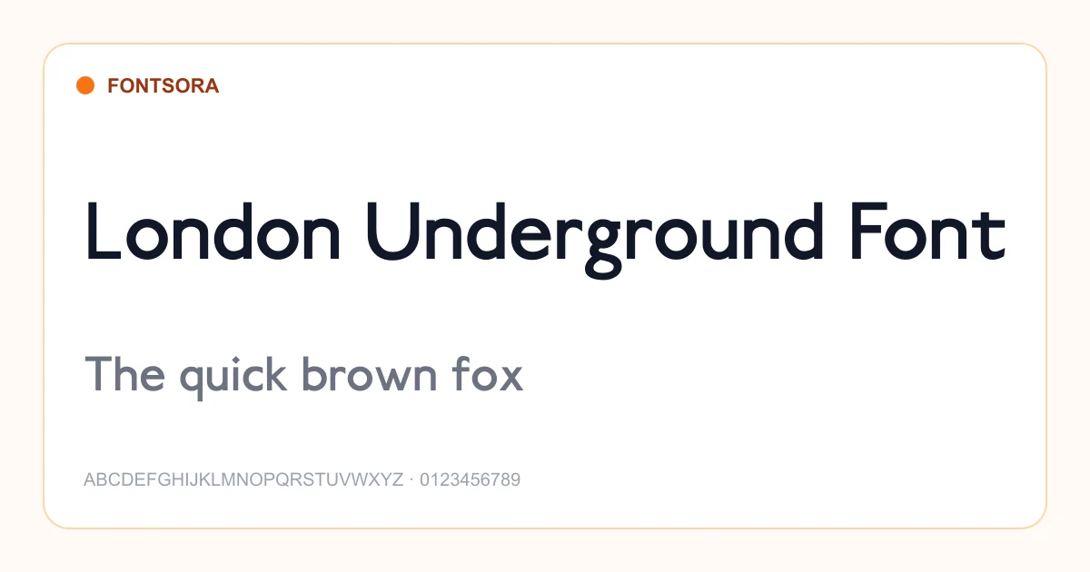
Serif Fonts
Timeless serif fonts with traditional letterforms conveying authority and readability.
22 fonts in this category
Advertisement
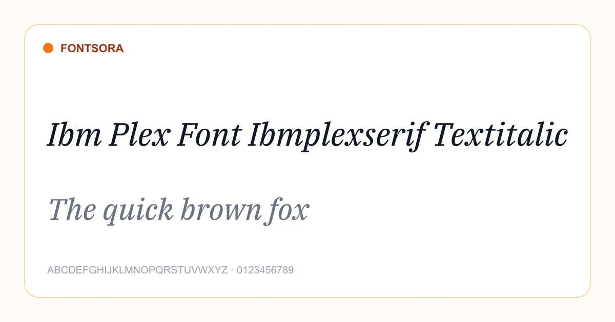
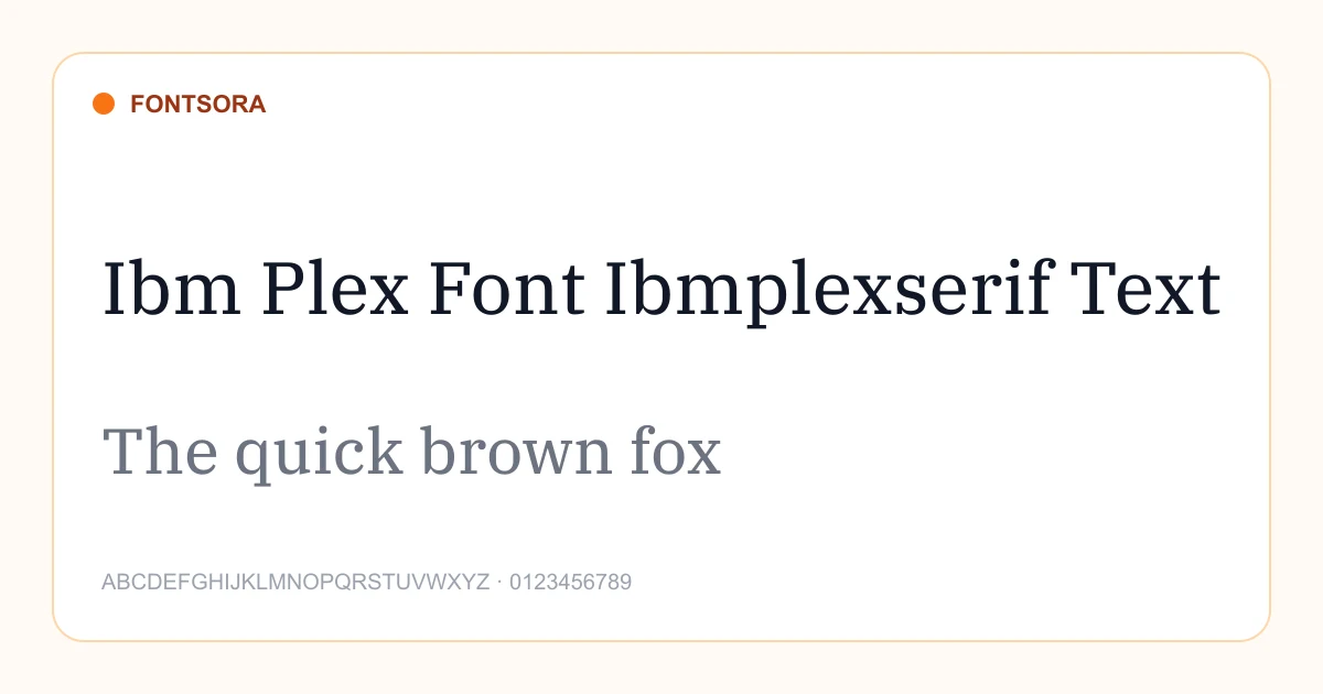
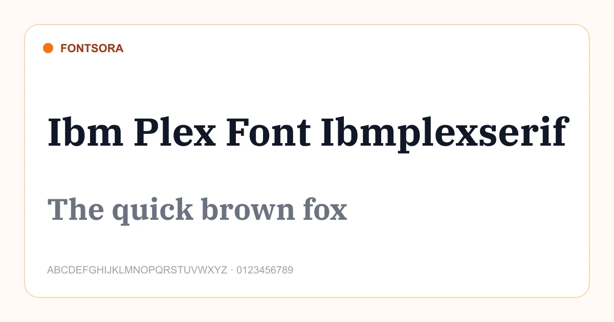
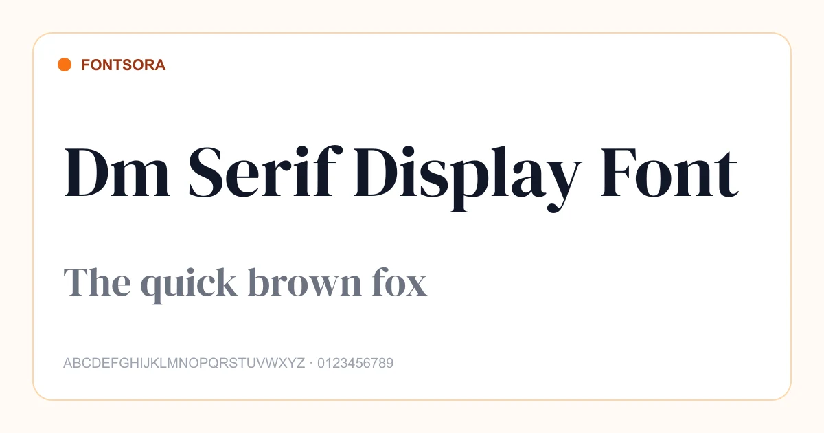
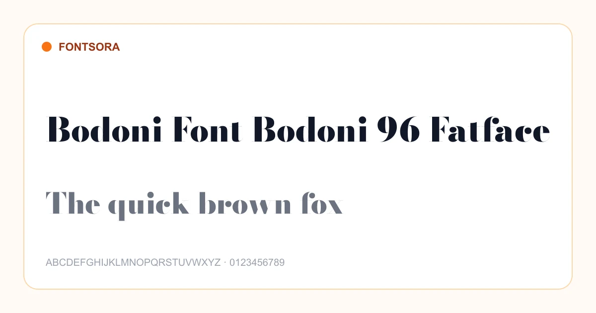
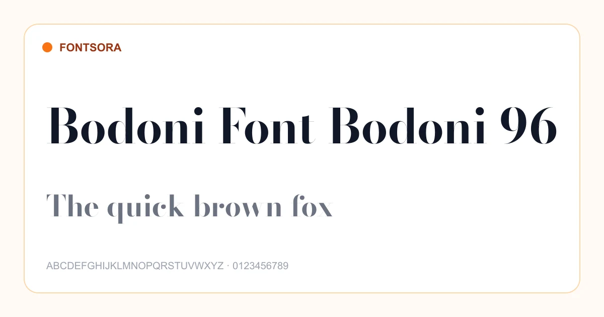
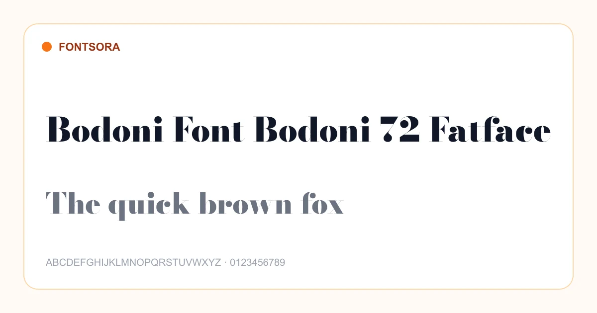
How to choose a serif font
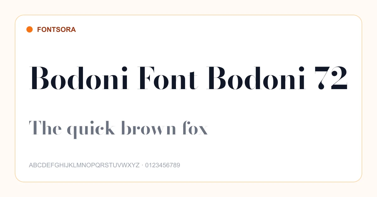
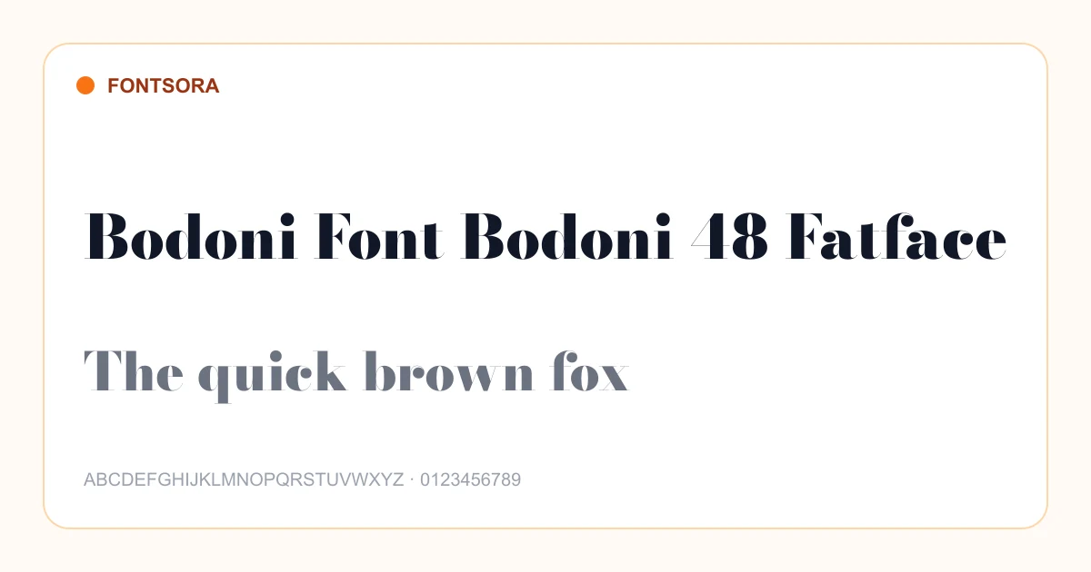
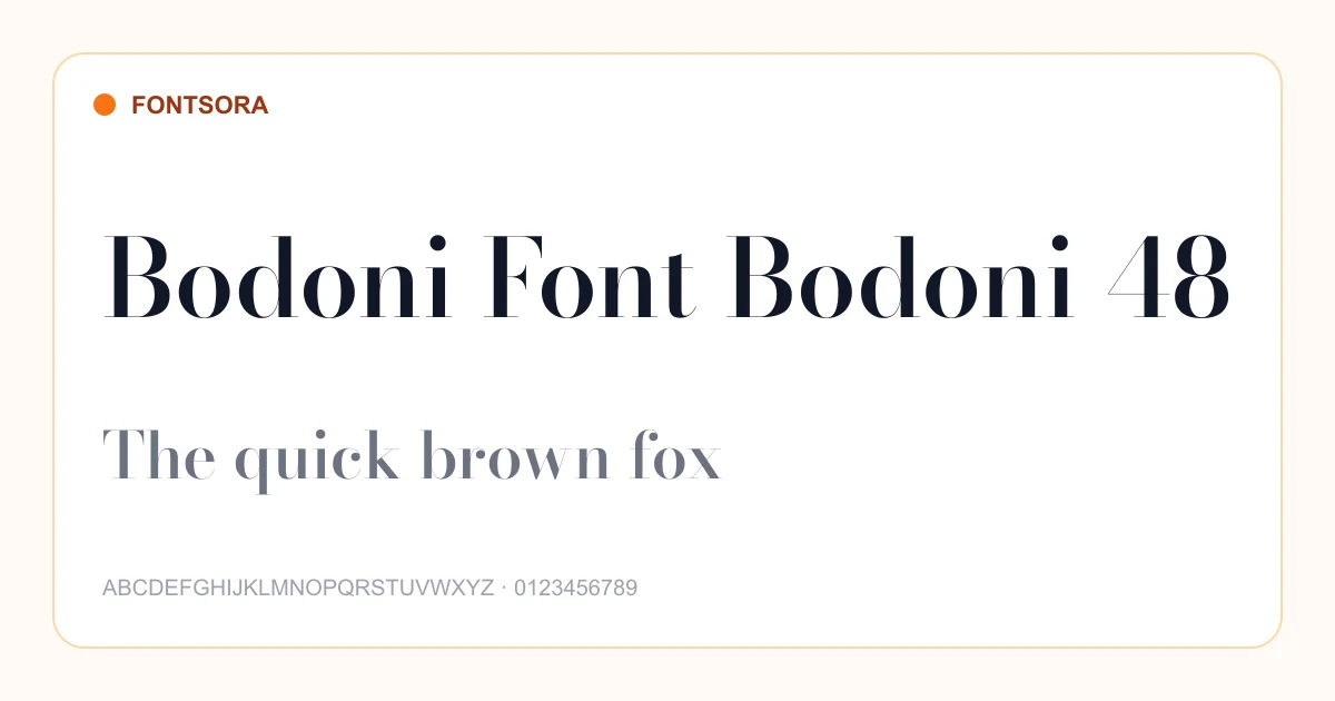
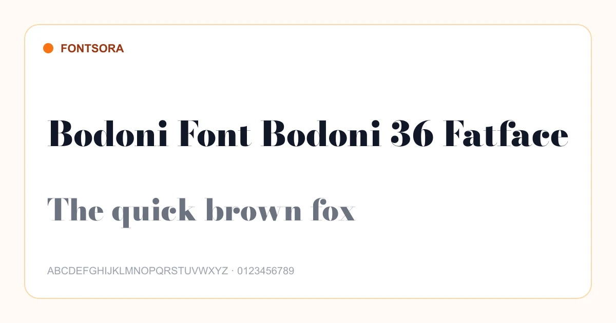
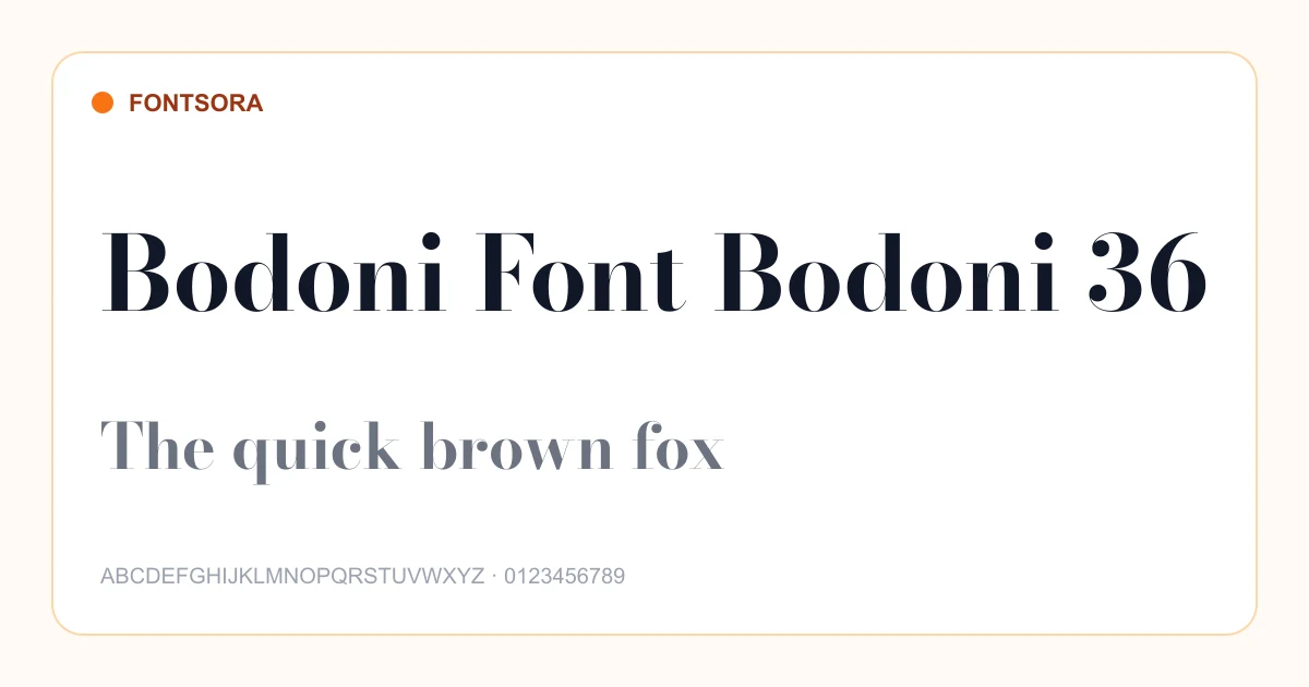
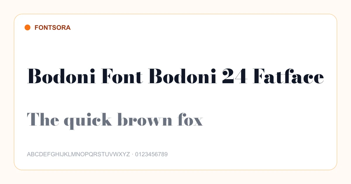
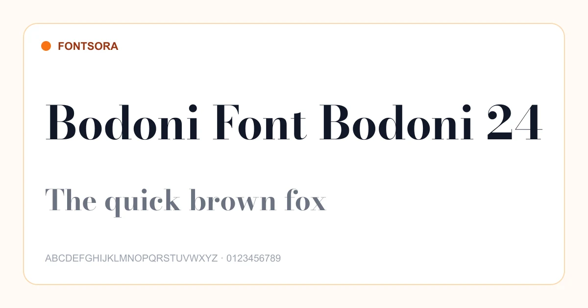
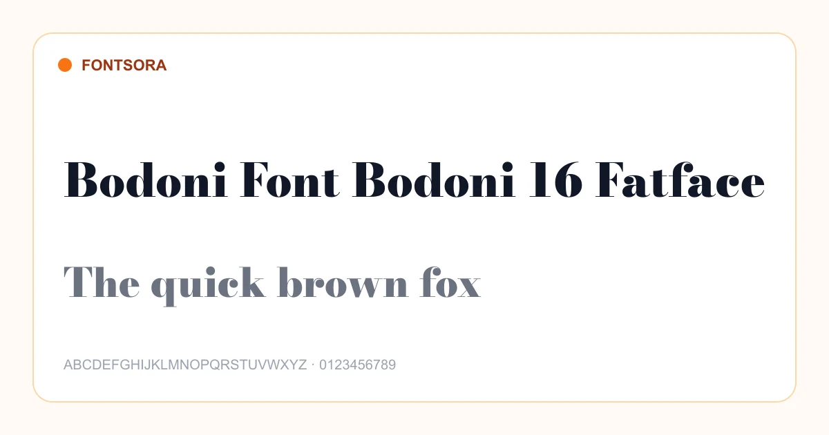
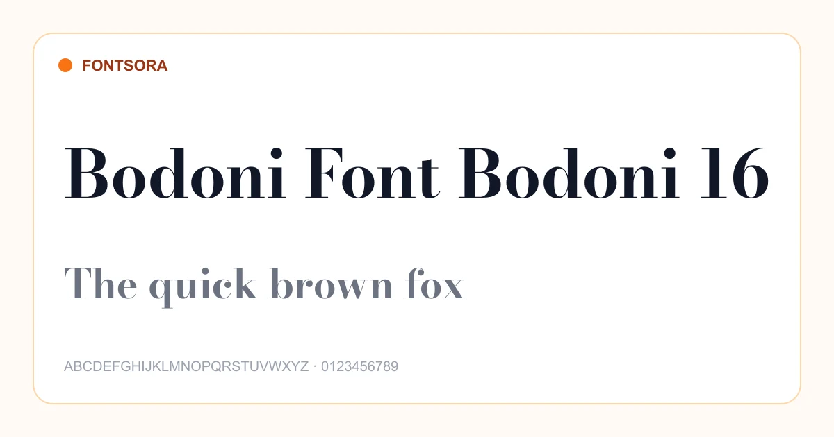
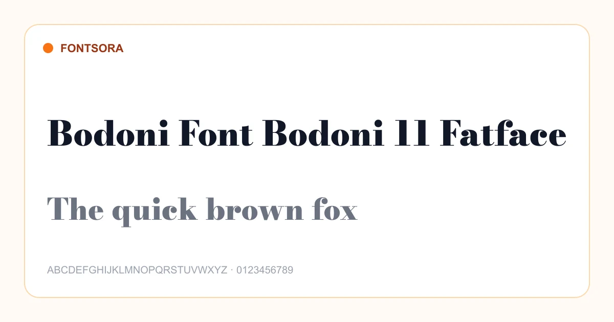
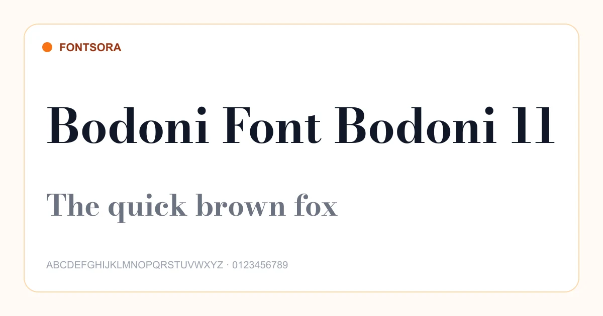
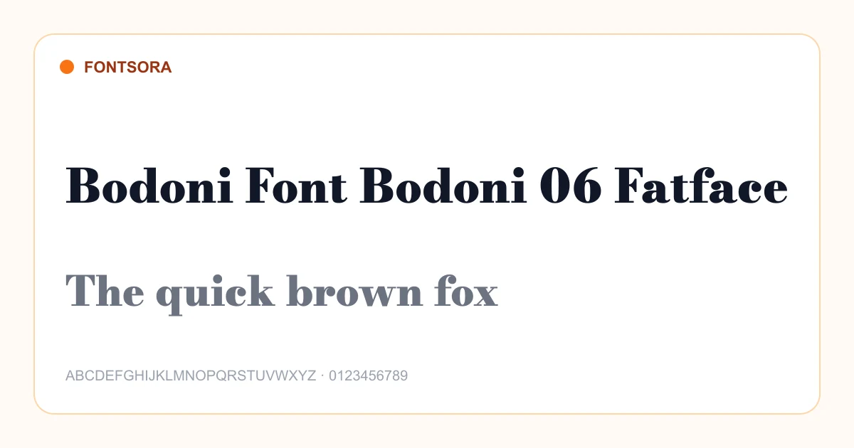
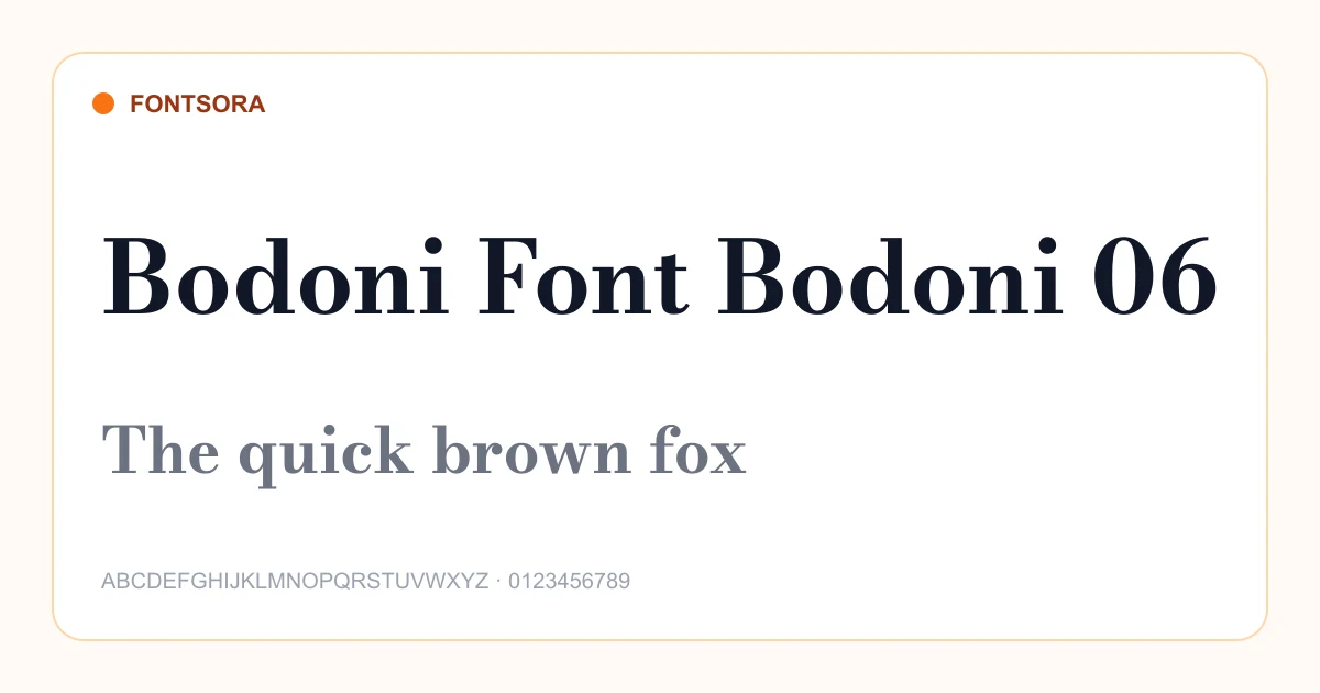
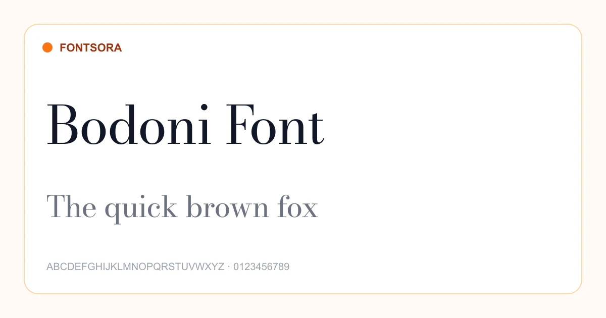
Serif fonts feature small finishing strokes that help create rhythm and character across a line of text. They range from quiet book faces to high-contrast editorial and luxury styles, making them useful for publishing, long-form reading, identities, invitations, and premium packaging. The right choice depends on reading size, contrast, spacing, and the mood the typeface communicates.
Best uses
- • Books and long-form articles
- • Editorial layouts
- • Luxury branding
- • Invitations and stationery
Selection tips
- • Use a text-oriented serif with sturdy details for paragraphs and smaller sizes.
- • Reserve very high-contrast serif designs for larger headlines unless testing proves they remain clear.
- • Pair with a neutral sans serif when you need a contemporary supporting voice.
Serif font questions
What makes a font a serif font?
Serif typefaces include small strokes or extensions at the ends of major letterforms. Their proportions and contrast can vary widely between traditional and modern designs.
Are serif fonts suitable for websites?
Yes. Well-spaced serif fonts with clear shapes can be highly readable online, especially when used at an appropriate size and line height.
What does a serif font communicate?
Depending on its design, a serif can suggest editorial authority, heritage, elegance, warmth, or craftsmanship.
Preview your own wording on each font page and review its license before publishing or selling your design. Browse the complete Fontsora font library to compare more styles.
Other Categories
Script
Elegant cursive and flowing script typefaces perfect for logos, invitations, and creative projects.
13 fonts
Calligraphy
Classical and modern calligraphy typefaces inspired by traditional pen-and-ink lettering.
1 font
Sans Serif
Clean, modern sans-serif typefaces ideal for UI design, branding, and digital content.
44 fonts
Display
Bold, expressive display fonts designed to command attention in headlines and posters.
420 fonts
Decorative
Ornate and decorative typefaces that bring personality and artistic flair to designs.
1 font
Gothic
Dark, dramatic gothic and blackletter typefaces with historical character.
4 fonts